Importing FastStore UI component styles
If you are using a FastStore UI component and want to apply its styles to your FastStore project, follow the steps below.
There are two use cases on how to import FastStore UI component styles:
- Importing styles when overriding a component: For this use case we will override the ProductTitle component within the ProductDetails section.
- Importing styles when creating a new section: In this example, we will create a new section in the CMS called
OurStore.
Before you begin
Ensure you have a basic understanding of creating a new section in the Headless CMS. Refer to Create a new Section guide for more information. Additionally, we recommend using CSS Modules (opens in a new tab) for styling your new component.
Importing styles when overriding a component
For this use case we will override the ProductTitle component within the ProductDetails section.
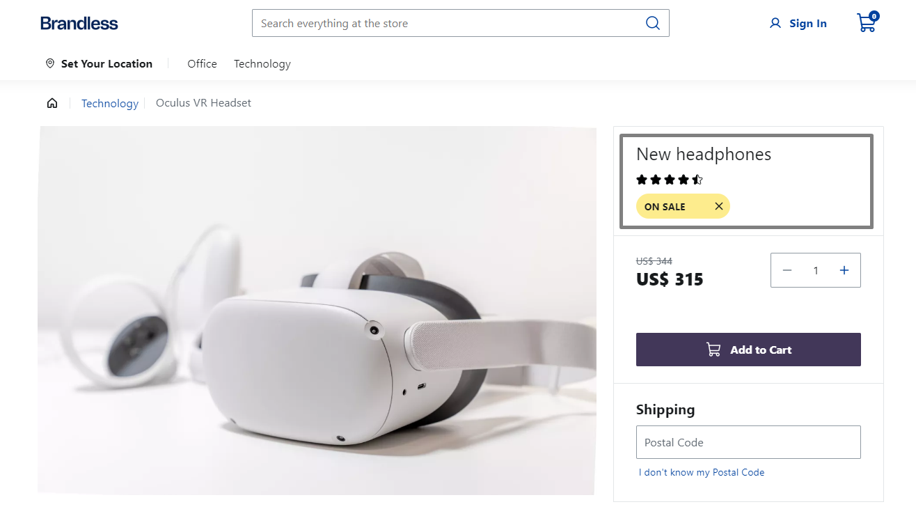
Step 1 - Create the custom component
-
Open your FastStore project and navigate to the
componentsfolder and create thecustomProductTitle.module.scssfile. This file is responsible to import the FastStore UI component style. -
Add the following code to the
customProductTitle.module.scssfile.
.customProductTitle {
  @import '@faststore/ui/src/components/molecules/Tag/styles.scss';
}
This will import the Tag styles to the custom component that you are creating.
- In the
componentsfolder, create theCustomProductTitle.tsxfile. - Add the following to the file:
import React from 'react'
import { ProductTitle, Tag } from '@faststore/ui'

import styles from './customProductTitle.module.scss'

export default function CustomProductTitle() {
  return (
    <section className={styles.customProductTitle}>
      <ProductTitle title={<h1>New headphones</h1>} />
      <Tag variant="warning" label="On sale" onClose={() => {}} />
    </section>
  )
}
This code creates a custom ProductTitle component displaying the product title, star rating, and a tag indicating that the product is on sale.
To make it available, declare this new component in the ProductDetails, as outlined in the next section.
Step 2 - Overriding the component
- In the
overridesfolder, create theProductDetails.tsxfile. - Add the following code to the
ProductDetails.tsxfile to render the newCustomProductTitlecomponent.
import { SectionOverride } from '@faststore/core'

import CustomProductTitle from '../CustomProductTitle'

const SECTION = 'ProductDetails' as const

const override: SectionOverride = {
  section: SECTION,
  components: {
    ProductTitle: { Component: CustomProductTitle },
  },
}

export { override }- Run
yarn devin the terminal and open the local development server to see the changes. You should see a result similar to the image below:
Importing styles when creating a new section
Step 1 - Add a new section object to the Headless CMS
- In the FastStore root directory of your project, create a folder named
cms. - Inside
cms, create thefaststorefolder and add asections.jsonfile. - In the
sections.jsonfile add the new section that you want to display in the Headless CMS. The schema below defines how the Headless CMS renders theOurStoressection that we will use in the example:
[
  {
    "name": "OurStores",
    "schema": {
      "title": "Our Stores",
      "description": "Search stores near to the users",
      "type": "object",
      "required": ["title", "description"],
      "properties": {
        "title": {
          "title": "Title",
          "type": "string",
          "default": "Explore Nearby Stores"
        },
        "description": {
          "title": "Link Path",
          "type": "string",
          "default": "Discover the closest store to you and pay us a visit."
        }
      }
    }
  }
]
Step 2: Create the new section
- If you don't already have it, create a folder named
componentsinside thesrcdirectory. - Inside the
componentsfolder, create a file namedOurStores.tsxand add the following code:
import React from 'react'
import { Button, Icon, SelectField } from '@faststore/ui'

export interface OurStoresProps {
  title: string
  description: string
}

export default function OurStores(props: OurStoresProps) {
  return (
    <section>
      <h2>{props.title}</h2>
      <p>{props.description}</p>
      <div>
        <SelectField
          id="select-state-store"
          label="State:"
          options={{
            newYork: 'New York',
            arizona: 'Arizona',
            massachusetts: 'Massachusetts',
            hawaii: 'Hawaii',
          }}
        />
        <SelectField
          id="select-city-store"
          label="City:"
          options={{
            newYorkCity: 'New York City',
            phoenix: 'Phoenix',
            boston: 'Boston',
            honolulu: 'Honolulu',
          }}
        />
        <Button
          variant="secondary"
          icon={<Icon name="ArrowRight" />}
          iconPosition="right"
        >
          Find Store
        </Button>
      </div>
    </section>
  )
}
For this section we will use the following component from the Faststore UI: Button, Icon and SelectField.
- Create a file named
index.tsxinside the components folder, and add the following code:
import OurStores from './OurStores'

export default { OurStores }
Step 3: Synchronize the new section with the Headless CMS
-
In the terminal, run
faststore cms-sync. -
After the sync, you should be able to see
info: CMS synced successfully...message. -
Run
yarn devto run the store locally. -
Go to the VTEX Admin and access Storefront > Headless CMS.
-
Click on the
Homecontent type. (We will add it to the Home just for testing purposes) -
In the
Sectionstab, click the+, search for the newOur Storessection, and add it to your page. -
Click on
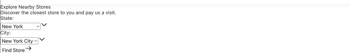
Save. To see the section on the storefront, refer to the How to preview changes in development mode guide. You should see the new section but without styles as the example below:
Step 4: Add the Styles
Now that we have the section in the page, let's add some styles to it:
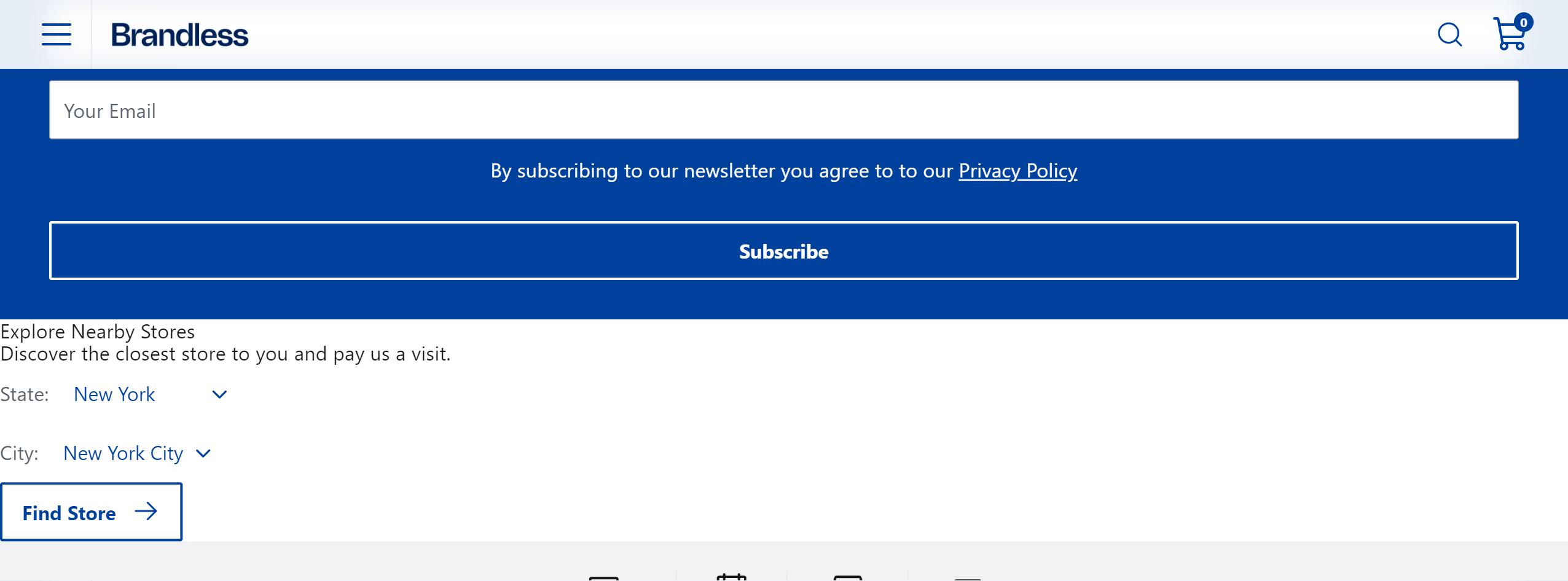
-
In the
componentsfolder, create theourStores.module.scssfile. This file will import the FastStore UI components styles. -
Add the following code to the
ourStores.module.scssfile:
.ourStores {
  @import '@faststore/ui/src/components/atoms/Button/styles.scss';
  @import '@faststore/ui/src/components/atoms/Select/styles.scss';
  @import '@faststore/ui/src/components/molecules/SelectField/styles.scss';
}
This will import the Button and SelectField styles to the custom component that you are creating.
You'll need to also import Select component styles since SelectField inherits it.
- Now, import this stylesheet to
OurStores.tsxfile and apply it.
import React from 'react'
import { Button, Icon, SelectField } from '@faststore/ui'

import styles from './ourStores.module.scss'

export interface OurStoresProps {
  title: string
  description: string
}

export default function OurStores(props: OurStoresProps) {
  return (
    <section className={styles.ourStores}>
      <h2>{props.title}</h2>
      <p>{props.description}</p>
      <div>
        <SelectField
          id="select-state-store"
          label="State:"
          options={{
            newYork: 'New York',
            arizona: 'Arizona',
            massachusetts: 'Massachusetts',
            hawaii: 'Hawaii',
          }}
        />
        <SelectField
          id="select-city-store"
          label="City:"
          options={{
            newYorkCity: 'New York City',
            phoenix: 'Phoenix',
            boston: 'Boston',
            honolulu: 'Honolulu',
          }}
        />
        <Button
          variant="secondary"
          icon={<Icon name="ArrowRight" />}
          iconPosition="right"
        >
          Find Store
        </Button>
      </div>
    </section>
  )
}
You should be able to see something like:
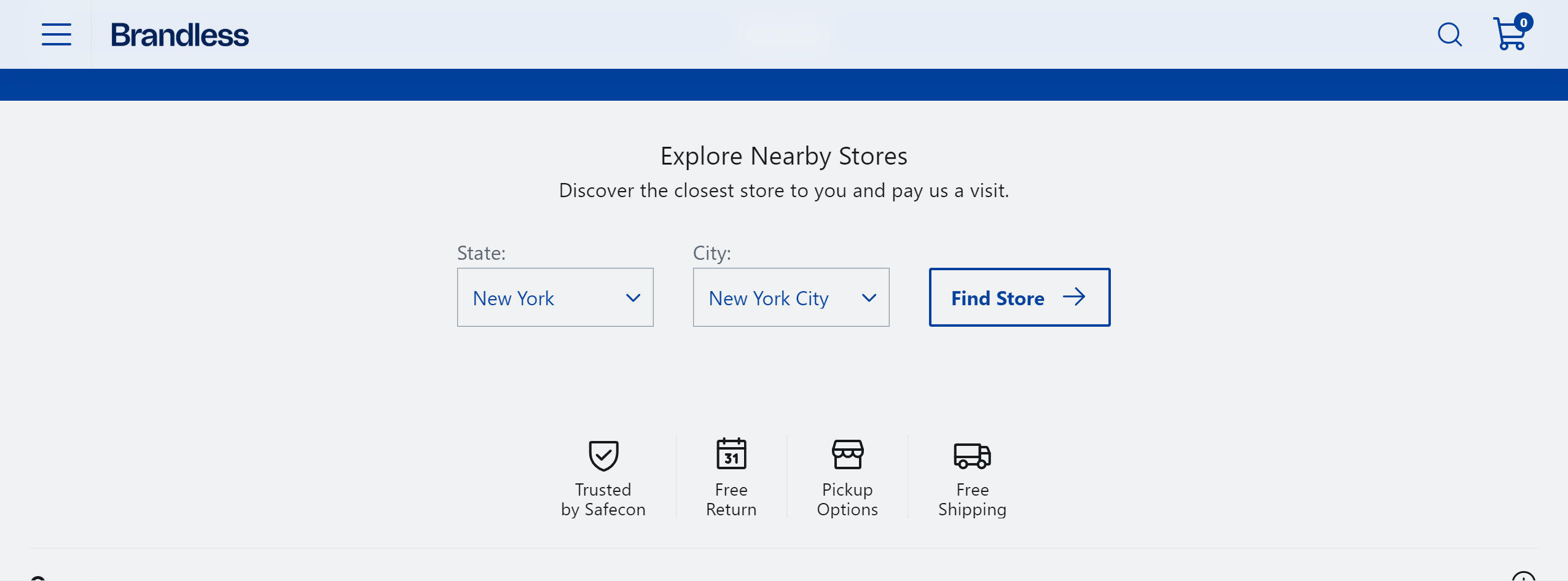
- Let's add more styles to it. You can customize it using our design tokens and component's data attributes.
.ourStores {
  @import '@faststore/ui/src/components/atoms/Button/styles.scss';
  @import '@faststore/ui/src/components/atoms/Select/styles.scss';
  @import '@faststore/ui/src/components/molecules/SelectField/styles.scss';

  width: 100%;
  display: flex;
  flex-direction: column;
  justify-content: center;
  align-items: center;
  padding: var(--fs-spacing-5);
  margin: auto;
  background-color: var(--fs-color-neutral-bkg);

  [data-fs-select-field] {
    flex-direction: column;
    align-items: flex-start;

    [data-fs-select] {
      border: var(--fs-border-width) solid var(--fs-border-color);
      margin-top: var(--fs-spacing-0);
      width: 10rem;
      height: var(--fs-control-min-height);

      select {
        width: 100%;
      }
    }
  }
}

.ourStores__title {
  font-size: var(--fs-text-size-title-section);
  margin-bottom: var(--fs-spacing-1);
}

.ourStores__content {
  display: flex;
  align-items: flex-end;
  column-gap: var(--fs-spacing-5);
  margin: var(--fs-spacing-5);
}import React from 'react'
import { Button, Icon, SelectField } from '@faststore/ui'
import styles from './ourStores.module.scss'
export interface OurStoresProps {
title: string
description: string
}
export default function OurStores(props: OurStoresProps) {
return (
<section className={styles.ourStores}>
<h2 className={styles.ourStores__title}>{props.title}</h2>
<p>{props.description}</p>
<div className={styles.ourStores__content}>
<SelectField
id="select-state-store"
label="State:"
options={{
newYork: 'New York',
arizona: 'Arizona',
massachusetts: 'Massachusetts',
hawaii: 'Hawaii',
}}
/>
<SelectField
id="select-city-store"
label="City:"
options={{
newYorkCity: 'New York City',
phoenix: 'Phoenix',
boston: 'Boston',
honolulu: 'Honolulu',
}}
/>
<Button
variant="secondary"
icon={<Icon name="ArrowRight" />}
iconPosition="right"
>
Find Store
</Button>
</div>
</section>
)
}After applying these additional styles, you should be able to see this final look 🎉: